
What I spend the most time on in a layout is usually what no one sees in the end. The space between two lines, the margin I adjust for the fourth time, the area that is deliberately left blank because at some point I realized that any additional element would destroy exactly what I'm trying to say. And precisely this part of my work, which means the most to me, is the hardest for me to explain, because to most people, it simply looks like nothing.
I believe this is one of the most frustrating experiences a designer faces: that the decisions involving the real thought process are often invisible, while the obvious elements receive all the praise. No one compliments good whitespace. It only becomes noticeable when it's missing. And that's also why you constantly have to defend it against perhaps the oldest reflex of all: the urge to fill empty spaces.
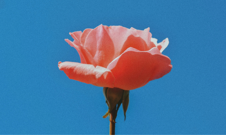
Emptiness is not nothing, even if it looks exactly like it
Let's start with the biggest misconception about this topic. Whitespace doesn't have to be white, nor does it have to be truly empty; it's simply the area where no content is deliberately placed, whether between two elements, around a heading, or at the edge of a page. Some also call it negative space, which I find more accurate because it doesn't sound quite so much like forgotten space.
This space does something, even if you can't see it. It guides the eye where it needs to go, it separates the important from the incidental, and it gives the eye the breathing room that enables the brain to process what it sees in the first place. A layout without these pauses is about as exhausting as someone who talks non-stop, and whom you eventually stop following—not because what they're saying is bad, but because you simply don't get a chance to keep up. That's precisely why you never notice good whitespace, but you immediately notice bad whitespace.
Horror vacui – The ancient fear of empty space
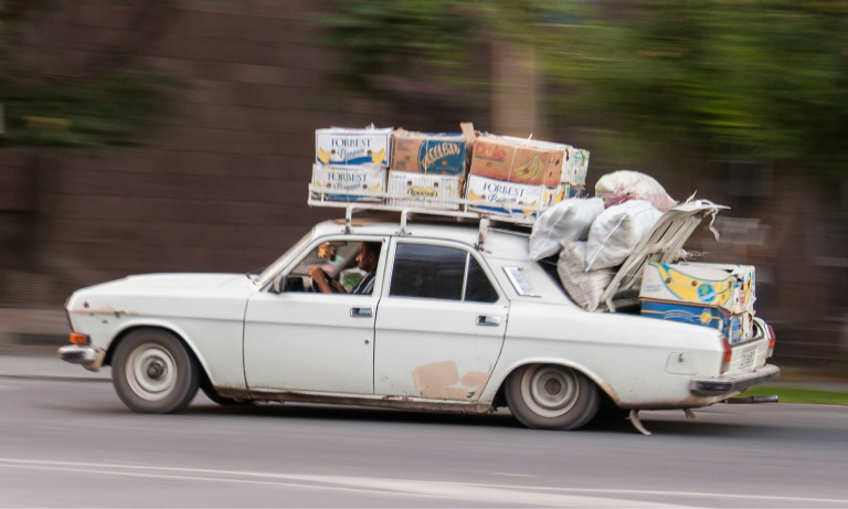
There's even a term for it, and it's over two thousand years old: horror vacui, the fear of emptiness. People have a deep-seated urge to fill empty spaces; a bare wall calls for a picture, an empty form field feels like an oversight, and a calm area in a layout strikes many as a missed opportunity. This leads to probably the most uttered sentence in design history, namely the question of whether it can't be filled somehow.
Sometimes it comes as a hint that there's still so much space, sometimes as a suggestion to add another logo, a slogan, or a testimonial, but it's always the same fear in a new guise, and I can even understand it, because no one likes paying for a half-empty page when they feel like they're paying for every millimeter. The tricky part is that this fear is a terrible advisor, because every element you cram in to banish the emptiness takes away a piece of attention from all other elements, until in the end everything is equally important, and thus nothing stands out anymore. A cluttered page doesn't tell you more; it tells you less, just louder.
Why space looks like money
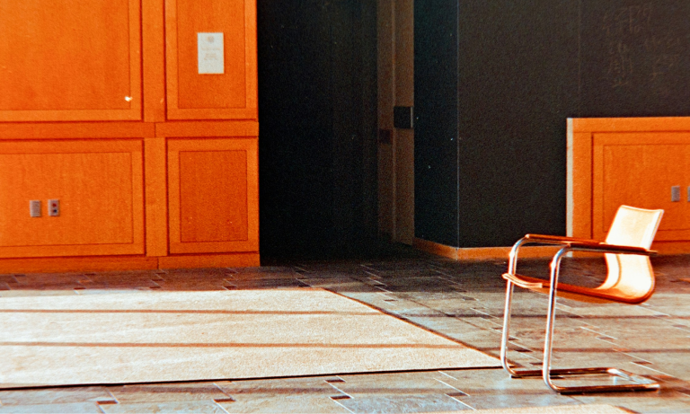
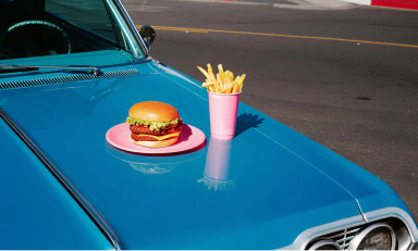
Once you pay attention, you'll notice it everywhere: Luxury brands embrace emptiness; budget brands shy away. This is no coincidence, nor a matter of budget, but an attitude, because a lot of space around a single object sends a very clear message: that you don't need to overwhelm someone with everything at once, and that you are so confident in what you're showing that a single piece is enough.
Essentially, it's about attention as currency. A page that shows you exactly one thing and allows it to breathe in space thereby asserts that this thing is worth looking at, whereas the same page that shoves forty things in your face at once essentially admits it doesn't even know what's important. One feels like a recommendation from someone with taste, the other like a bargain bin, and I argue that this difference has less to do with price than with respect for the attention of the person viewing it. Ultimately, space is a form of respect, and respect almost always translates into value.
The pause is part of the music
The analogy that makes the most sense to me doesn't come from design, but from music, because what allows a piece to breathe isn't just the notes, but at least as much the silence in between. Miles Davis is often quoted as saying it's about the notes you don't play, and if you imagine music without any pauses – a continuous sonic mush without rhythm or tension – then you have pretty much the acoustic counterpart to a layout with no whitespace left.
The same principle applies wherever people want to present something effectively, for instance, in a museum, where you wouldn't hang forty pictures frame-to-frame, but instead give each one enough space to truly make an impact. This comparison is especially important to me because it demonstrates that whitespace isn't about personal taste, but rather a perceptual mechanism that functions quite independently of the medium.
Fortunately, I'm not alone in this
It's reassuring, at least, that I'm not making all this up, and that people who have thought about this topic much more seriously than I have come to pretty much the same conclusions, just more elegantly. In Japan, there has long been a specific word for meaningful empty space, ma (間), which doesn't perceive emptiness as a lack, but as a charged pause, as the 'in-between' that gives things their true effect, whether in architecture, theater, or design. Kenya Hara, who has been the art director behind MUJI for over two decades, has built an entire philosophy around this, even writing a book simply titled "White," in which he describes emptiness as a kind of vessel that gains meaning precisely because it dictates nothing and allows the viewer space to project their own thoughts into it. The fact that of all things MUJI, a brand essentially built on omission, has built a billion-dollar business from it, I find to be the most compelling proof that emptiness is anything but a deficiency.
But to prevent this from sounding like an exotic idealization, a look at Western modernism helps, because there you find the same conviction, just with less poetry and more grids. Massimo Vignelli, the Italian designer to whom we owe, among other things, the New York subway's wayfinding system, came from the tradition of Swiss typography, where reduction was never considered poverty, but the highest form of discipline. He spent his entire professional life working with a handful of typefaces and a great deal of deliberately placed negative space, because for him, empty space was not a deficit to be excused, but the visible proof of order and clarity. If someone like Vignelli spends decades perfecting omission above all else, then in my next conversation, it will be much easier for me to calmly explain why that empty space should remain.
Why it's still a tough sell
And here lies the real catch that makes the whole thing so thankless. Everything I've described so far is ultimately invisible, because whitespace has no before-and-after effect that you could triumphantly reveal in a presentation. It makes no noise and produces no audible astonishment, but at best a feeling that no one consciously registers – that quiet sense that something appears calm, clear, and valuable, without being able to pinpoint exactly why.
That's precisely why emptiness is always the first thing sacrificed during revisions, because no one defends it, and because it looks like unused space that surely could still be utilized. Yet it's not a gap, but a decision, and the difference between the two is roughly as significant as that between a blank sheet of paper and a poem deliberately set with generous margins. The honest truth, however, is that this is a rhetorical problem, not a design one, because you have to be able to explain why emptiness works, otherwise the whole thing truly sounds like an excuse for unfinished work. The phrase 'it's all intentional' is never enough, whereas pointing out that the space guides the eye to the heading and that both elements would compete for the same attention without it, is indeed sufficient. It's essentially the same lesson that applies to almost everything in design: if you can't justify what you're doing, you lose the argument.
What this means in practice
For me, the main takeaway is to treat whitespace as a design element from the outset and actively plan for it, rather than letting it emerge as a byproduct, because only then will it be perceived as a conscious decision and not merely as something that hasn't been filled yet. It also helps to anticipate the 'fill it up' question before it's asked, and to provide an explanatory, rather than defensive, answer, and if in doubt, simply place the 'stuffed' version next to it, because nothing sells the effect of emptiness better than a direct comparison with its opposite.
What I constantly have to remind myself, however, is also the uncomfortable part: that sometimes you still lose this discussion and the space does get filled, and that's okay, as long as you've argued your point with a rationale and not just a matter of taste. The difference between saying you simply prefer something this way and saying something works this way and why, is ultimately the difference between a preference and a design decision, and only the latter can be defended without relying on personal gut feeling.
What remains
What I actually like about this topic is that it appears so unassuming, yet reveals almost everything about one's approach to design. It's not about emptiness always being better, because a densely packed brochure designed to cram twenty offers into your brain in three seconds is perfectly justified in being crammed full. It's about emptiness being a decision, not an absence of decision, and that's precisely why it deserves to be taken seriously and not treated as the place where design simply stops.
Empty space is rather the place where a design most subtly and yet most clearly tells you what to look at, and I think that's a beautiful idea for something that looks like nothing. The next time I'm asked if something can't be filled, the honest answer will probably be that it could, but it's better left alone, because the emptiness is already doing its job, and you just need to let it be.
TL;DR
Whitespace is an active design decision, not the leftover space once everything else has been placed. It guides the eye, creates hierarchy, and allows content to breathe, which is why ample space conveys value and confidence, while cramped space quickly looks like a bargain bin. The reflex to fill every empty area doesn't make a message stronger, but merely louder and less clear, and anyone who wants to preserve whitespace is best advised to defend it with a rationale rather than personal taste.


.png)