
That's no coincidence, nor is it a cost-saving measure. It's a statement. Because a logo is essentially a small confession. It says: Please remember who we are – you wouldn't on your own. The strongest brands don't need this confession. They have something better. They have codes.
What *are* brand codes, anyway? (No buzzword bingo, promised)
Brand codes are the recognizable elements by which you identify a brand before reading its name. A color palette. A design language. A material. A tone of voice. A ritual. Sometimes just a detail, repeated so consistently that it becomes a signature.
The logo is the bare minimum. The absolute minimum. It says "It's me," but it tells nothing. Brand codes tell everything and don't even need to mention the name. And the beauty of it: codes can be built. You're not born with them; you build them, detail by detail, over years. Like all good things. Annoying, I know.
Four brands have executed this so uncompromisingly that they can be treated as case studies. Four completely different worlds – a pen, a skincare, a sports car, a bag. The same mechanics.
Montblanc: How a tiny white star says more than any company name
Someone pulls out a pen in a meeting, and there's a small white star on the cap. You immediately know what it is, roughly what it cost, and what signal has just been sent. A detail, hexagonal, white – and it carries more brand information than most logos ever will.
The code: this star.
It represents the snow-capped peak of Mont Blanc, in the same spot for over a hundred years. Plus the number 4810 – the mountain's height in meters – engraved where other brands would slap their name. That's the kind of detail that only works if you never touch it. Montblanc could have "modernized" the star a hundred times. It didn't. And that's why today it's no longer a logo in the classic sense, but a distinguishing mark that sits on the cap like a silent status symbol.
What Montblanc understood: A single, unshakeable symbol beats any wordmark.
Nobody reads "Montblanc". You see the star. That's the difference between a logo you have to decipher and a code you feel.
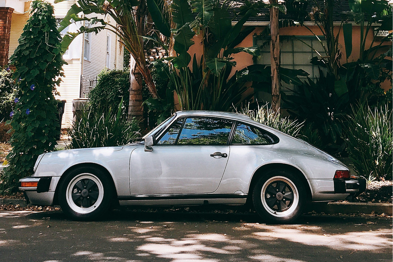
Porsche 911: How to sell the same car for sixty years
The Porsche 911 has been built since 1963, and its silhouette has essentially remained the same: the low-slung shape, the sloping rear, the round headlights. Yes, many cars are recognizable by their shape – but hardly any has so stubbornly defended its basic lines for over six decades. That's the difference between "recognizable" and "untouchable".
The code: this line.
Of course, everything has changed technically. But the form is sacred. Porsche takes this so seriously that designers are more afraid of their loyal customer base than of the competition when a model changes. You don't change the silhouette of a 911. You carefully reinterpret it, down to the millimeter, and pray that no one misunderstands.
What Porsche proves with this: Recognizability is more valuable than novelty.
The 911 doesn't want to look "fresher" every year. It wants to look like a 911 – and that's its biggest asset. You don't need the crest. The line is enough. In an industry obsessed with "entirely new design languages," Porsche has essentially said no for decades. That no is worth billions.
Aesop: How to build an empire without ever raising your voice
Aesop sells soap. I have to emphasize that again: Soap. At prices where you'd normally expect at least a small enlightenment to be included. And yet, L'Oréal bought the brand in 2023 for around 2.5 billion dollars. For a brand that never screamed. One that has essentially been doing the same thing since 1987 – with an almost annoying consistency.
The codes: amber glass bottles.
Cream-colored labels with sober, almost clinical typography that looks like it's from a scientific journal. No faces. No glamorous glossy images. No "before/after" promises. Instead, long, literary texts that talk about philosophy while selling you a hand cream. And stores, no two of which look alike – each tailored to its neighborhood.
What Aesop understood: Restraint reads as self-confidence.
In a category where everyone is shouting, the brand that whispers is automatically the adult in the room. This isn't a fluke, but a system so rigorously maintained that every product, every store, every text is recognizable as part of the family. Aesop is an "edited brand" – it says no to almost everything. And precisely this "no" is the code.
Bottega Veneta: How to omit the logo and still be recognized by everyone
And now, the purest form of the entire thesis. Years ago, Bottega Veneta coined a phrase that essentially means: When your own initials are enough. Translated: We don't need to print our name on the product – and neither do you, to know what you're wearing.
The code: the Intrecciato.
This woven leather, where thin strips are interlaced to create an unmistakable texture. No lettering, no monogram, no "BV" in capital letters across the entire surface. Just the weave. And that's enough. The right target audience recognizes a Bottega from a distance – not despite the missing logo, but because of the self-assurance inherent in this omission.
This is the real stroke of genius, and it takes the entire topic to its extreme: Bottega proves that the strongest brand code is sometimes the deliberate absence of the obvious. While other luxury houses print their logos as large as possible, Bottega has said: We trust our work to speak for itself. This is risky. It only works if the material is so distinctive that it can replace the logo. At Bottega, it does. This is precisely where the logic we started with concludes: The strongest branding in the world can do without any branding symbol at all.
What the four have in common (besides being expensive)
At first glance, a fountain pen, skincare, a sports car, and a handbag have very little in common. If you put the four of them at a party, they probably wouldn't say a word to each other.
But the underlying mechanics are identical. All four have a clearly defined system of recognizable elements – a symbol, a line, a reduction, a material. All four repeat this system with an almost irritating discipline. And all four have understood that the logo is the least important part of this system. Bottega omits it entirely and loses nothing in the process.
The trick is not to be "flashy." The trick is to be distinctive – and to maintain that for years, even when it gets boring. Especially then. Most brands don't fail due to a lack of creativity. They fail due to a lack of patience. They build a good system and then discard it after two years because someone wanted "a breath of fresh air." That is the death of every code.
What this means in practice (and why it's uncomfortable)
Most clients think their logo is strong. Even those whose logo looks like it was created in a Word document in 2009. Nobody likes to hear that their face is the problem. And usually, it isn't. The problem is the lack of a system behind it.
Because a logo alone doesn't make you recognizable. You become recognizable through codes that you consistently adhere to – across every touchpoint, every post, every piece of packaging, every detail. This is a much more uncomfortable message than "we'll draw something pretty for you," because it sounds like years of discipline rather than a nice project with an end date.
And yes – that also applies to small brands without the budget of Kering or Porsche. Codes don't cost money; they cost decisions. Choose a color and stick with it. Find a tone of voice and don't change it every three posts. Make a detail your signature and repeat it relentlessly. Anyone can do that. Most just don't, because perseverance is less fun than starting anew.
Key Takeaways
Back to the nameless bag. The reason the right person recognizes it immediately isn't a loud logo – there isn't one at all. It's the fact that Bottega consistently executed a single decision – this weave – for decades, to the point where the material became its signature. That's the whole magic. Except it's not.
Whether it's a star, a line, a bottle, or a weave: In all four cases, I don't see a "bold logo" even once. I see brands that made an early decision about who they are – and then had the patience to repeat it until the name became optional. In Bottega's case, until it disappeared entirely.
That's not talent and not a budget trick. It's the most boring, unsexiest thing in the world: consistency. And if that depresses you, here's the good news – consistency is learnable. Unlike a hundred years of a white star on a pen cap, you can start today.
TL;DR
A logo identifies. Brand codes define. The latter is the real work.
Montblanc relies on a symbol, Porsche on a line, Aesop on reduction, Bottega on a material – and omits the logo entirely.
Brands rarely fail due to a lack of creativity, but mostly due to a lack of patience.
Your logo is almost never what you're recognized by. It's the minimum, not the decisive factor.
Codes don't cost money. They cost decisions – and the perseverance that follows.


.png)